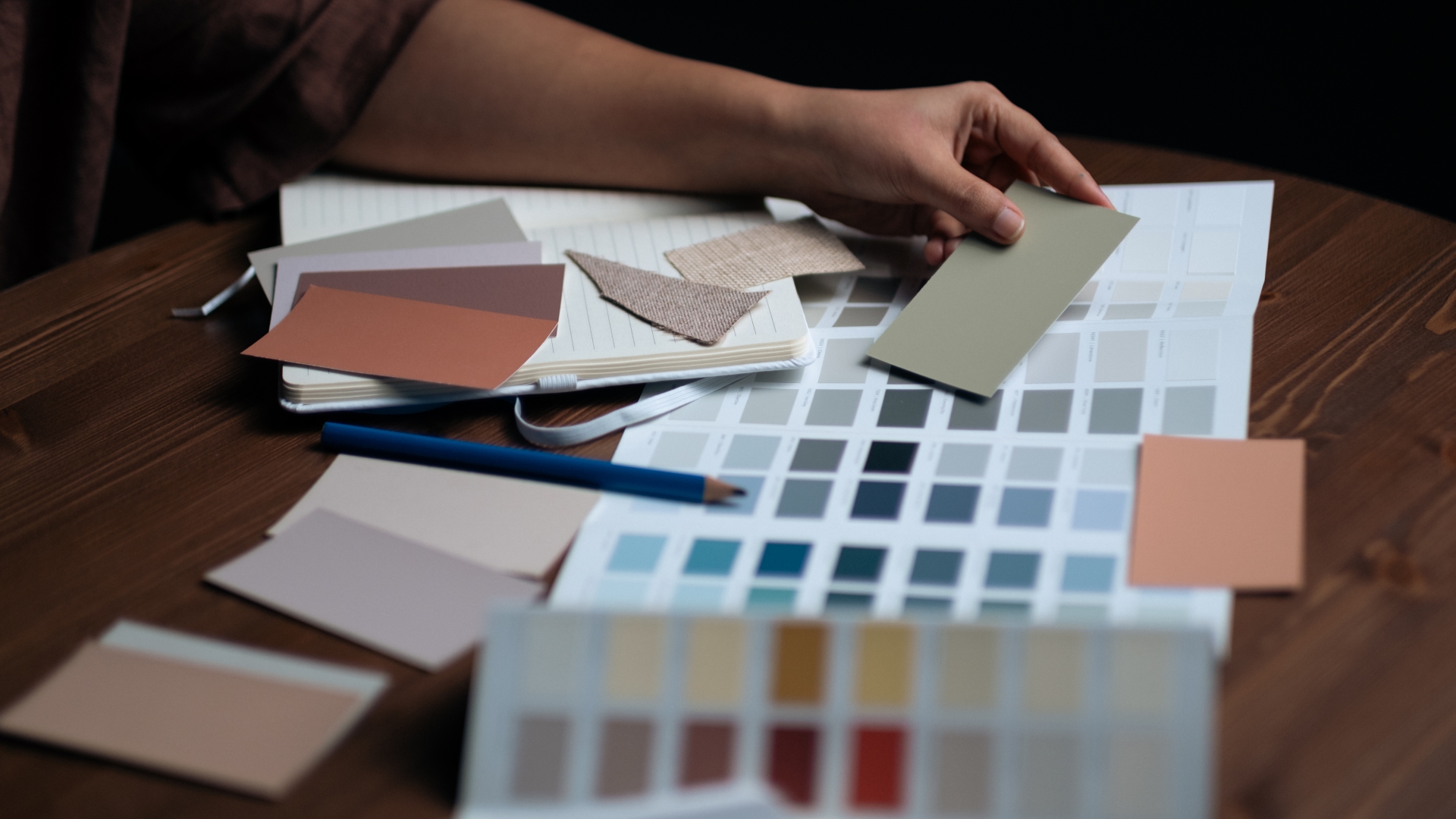
Designing with Feeling - Choosing the Right Colour Palette for Every Room
Luxury spaces are designed with precision and purpose, from the furniture and decor selections to the room sizes and the paint colour. Every room has a purpose, and the most successful interiors quietly reinforce that purpose through overlooked aspects like light, texture, proportion, and colour.
So many people treat colour as the finishing touch of a room, while experienced designers know it’s something to build off – something to encapsulate the feeling they want a room to create. Should it encourage conversation? Invite relaxation? Inspire focus? Your answers to those questions should determine your palette before the first paint sample is even chosen.
The Living Room: Warmth Without Noise
When it comes to the living room, it should feel welcoming from the moment you walk in. Not only is it the main entertaining space for every time you host, but it’s where your immediate family comes together for game nights, movie nights, or just to relax. So, it should invite people to settle in, stay awhile, and enjoy each other's company without demanding attention.
Some people think this means to fill the room with deep or bold colours, which can work, but in many luxury homes, understated palettes create the strongest impressions. Colours like soft taupes, warm greys, creamy whites, muted olive greens, and natural stone tones provide that calming, inviting, and warm atmosphere that was mentioned before, to be the muted canvas, allowing architecture, artwork, and carefully chosen furnishings to become the focal point.
Instead of relying on a bold paint job to bring the personality into a room, try building it through texture. Bouclé upholstery, natural wood, limestone fireplaces, woven rugs, and linen drapery all introduce depth while maintaining a calm atmosphere.
The Kitchen: Bright, Timeless, and Functional
The kitchen is another very important room to nail the vibe of. Similar to the living room, the kitchen needs to perform from morning until night.
Natural light plays a massive role here, because many kitchens have an abundance of it. This makes soft whites, warm neutrals, and subtle earth tones enduring favourites. Colours like these pair extremely well with sunlight, and don’t look boring or dull once the sun has gone down, and they’re timeless.
The most effective ways to introduce contrast often comes through cabinetry or islands rather than entire walls. Deep charcoal, forest green, or rich walnut can anchor a kitchen without overwhelming it, particularly when balanced by lighter countertops and the generous natural light many kitchens boast.
The goal should never simply be beauty. It should be to create a room that feels equally comfortable and functional when preparing breakfast on a weekday as it does when hosting friends and family on a weekend evening.
The Bedroom: A Place to Unwind
Bedrooms benefit a lot from restraint. This is arguably the room with the most important colour choice. The other rooms we talked about benefited from colours that took a back seat, let other elements do the “popping” for them, and the bedroom is similar, but for different reasons.
Obviously, the most important thing about a bedroom is that it’s a relaxing place that actually aids sleep. Choosing colours with lower saturation naturally encourage relaxation because they don't constantly compete for attention. Soft sage, dusty blue, warm ivory, muted clay, and gentle greys all create an environment that feels peaceful without becoming cold, and they also pop with natural light in the mornings and afternoon.
One of the easiest ways you can achieve this effect is through tonal layering. As opposed to introducing several unrelated colours, work within one family that allows the bedding, upholstery, curtains, and accessories to vary subtly in shade while remaining visually connected. The result will feel considered rather than coordinated.
Bathrooms: Creating a Personal Retreat
Luxury bathrooms are increasingly borrowing inspiration from boutique hotels and destination spas.
Stone, porcelain, brushed metals, natural wood, and soft lighting work together with restrained palettes to create an environment that encourages slowing down. Warm whites, pale limestone colours, soft sand, and muted greens remain timeless because they mirror colours found in nature. Even in smaller bathrooms, limiting the number of competing colours allows beautiful materials to become the centre of attention.
You would be surprised how much the right colour can boost your mood and efficiency during your morning and night time routines.
Home Offices: Calm Focus
For some reason, many work-from-home people put a lot of stock in their office being “interesting” or even “whimsical”, which is fine, but too much focus on that can lead to distraction.
The modern home office asks a lot from the colours in it. It should encourage concentration and focus during the workday, while still feeling connected to the rest of the home. Mid-tone neutrals, smoky blues, muted greens, and warm wood finishes tend to create environments that feel composed rather than clinical and disconnected.
Natural light should always influence the final decision. North-facing rooms often benefit from warmer palettes, while brighter southern exposures can comfortably accommodate cooler tones.
Outdoor Living Spaces: Bringing the Landscape Home
As outdoor living continues to become an extension of the home, colour palettes increasingly respond to the surrounding landscape rather than compete with it.
Natural stone, weathered wood, soft charcoal, sandy neutrals, and rich greenery allow gardens, mature trees, and changing seasonal colours to remain the stars of the space.
The most successful outdoor rooms rarely feel over-designed. Instead, they appear as though they have always belonged there.
Designing for Longevity
Obviously, colours can be subjective and nuanced. A stronger bold colour could work in any of these rooms as long as it’s a purposeful choice and doesn’t feel disconnected from the rest of the house. Another thing to consider is one of the biggest characteristics that separates many exceptional homes from those chasing trends: longevity.
Rather than selecting colours because they're popular this season, timeless interiors are built around palettes that continue to feel relevant years later. Architectural details, craftsmanship, artwork, and furnishings evolve over time, but a thoughtful foundation allows those pieces to change without requiring the entire home to be reinvented.
Luxury is rarely about making the loudest statement. More often, it's about creating spaces that continue to feel comfortable, elegant, and deeply personal long after the latest trends have disappeared.

